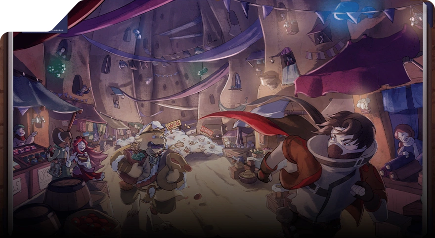
Featured Art: Motion Design Animation by Jatin Gupta by Carmelia Veanne
Proper composition ensures strong visual harmony in visual outputs, whether in movie scenes, a game environment design, or motion graphic projects. Having a strong grasp of composition ensures the main subject stands out, messages are communicated effectively, and visuals remain organized and clutter-free.
What is Composition in Graphic Design?
Composition is a design principle defined as arranging graphic elements into a cohesive and effective visual output. When used effectively, it guides your viewer through your visual output and creates a sense of balance.
Core Principles of Creating Effective Composition
When composing a visual output for any form of media, ensure that you implement these core principles:
1. Balance
Balance is generally achieved through visual symmetry or asymmetry. Symmetrical balance conveys stability, harmony, and order, making a design feel grounded and predictable. Conversely, asymmetry portrays visual interest and dynamic tension, creating a composition that feels energetic and engaging without resulting in visual clutter.
2. Emphasis
Emphasizing an element, whether it’s by enlarging its size or highlighting it through color, creates focal points that capture and direct the viewer’s attention. It ensures that the key message or graphic element is noticed first, giving the design a clear point of focus.
3. Alignment
The intentional alignment of your elements along a common edge or axis establishes order and consistency. Even subtle alignment choices can significantly influence how a visual output is perceived.
4. Negative Space
Also known as white space, negative space refers to the empty areas surrounding and between elements. Thoughtful use of negative space prevents visual clutter, enhances focus on key elements, and allows the design to "breathe." It can also add elegance and sophistication, turning simplicity into a striking statement.
5. Hierarchy
Visual hierarchy determines the order in which the viewer perceives elements. This can be done by using scale, color, contrast, and placement strategically to guide viewers through a composition in a logical, intentional way. A clear hierarchy ensures that the message is communicated efficiently, with the most important elements receiving appropriate attention.
6. Unity
Unity ensures that all components of the design work together cohesively. By harmonizing colors, typography, shapes, and images, unity creates a sense of completeness and visual clarity. A unified composition feels intentional and polished, giving the viewer confidence in the output’s purpose.
Essential Elements in Creating a Cohesive & Effective Composition

Featured Art: Motion Design Animation by Jatin Gupta
When creating animation or video game environments, every visual element contributes to the overall experience.
- Space: Space defines the arrangement of graphic elements within a composition and creates the perception of depth. In both 2D and 3D designs, distinguishing between foreground, middle ground, and background through proper spacing helps guide the viewer’s eye and establish a sense of scale and perspective. It also prevents overcrowding, allowing each element in your composition to have a visual impact.
- Graphic Elements: These include icons, symbols, and visual motifs that convey meaning, either directly or metaphorically. Each graphic element should reinforce the composition’s purpose and support the narrative or gameplay experience, rather than existing purely for decoration.
- Decorative Elements: Patterns, frames, ornaments, or abstract shapes can enhance the aesthetic appeal of a design without overpowering the main content. When used strategically, decorative elements add texture, rhythm, and visual interest while maintaining focus on primary graphics.
- Color: Strategic use of color is excellent for guiding attention, evoking emotions, and establishing mood. Consider incorporating complementary, analogous, or contrasting colours to enhance visual hierarchy and draw attention to focal points.
- Text (Captions): Since the text communicates both practical information and emotional tone of your composition, the font, size, line spacing, and alignment should be readable and complement the visual style. Typography can also function as a graphic element, enhancing composition and guiding the viewer’s flow through the visual output.
Expressive Means of Graphic Composition
To make your compositions dynamic while effectively communicating your vision, consider these expressive techniques:1. Meter / Rhythm
Rhythm establishes visual flow and movement within your design, giving even static scenes a sense of life. It can be:
- Uniform Rhythm: Repeating elements evenly, creating a steady and predictable pace. This works well in patterned backgrounds, textures, or organized environments.
- Ascending Rhythm: Gradually increasing size, intensity, or spacing to build tension or lead the viewer’s eye upward, often used to emphasize climax or focal points.
- Descending Rhythm: Gradually decreasing elements, slowing attention, or easing the visual journey, useful for guiding the eye toward background details or creating a sense of calm.
The rhythm of your composition can also be implied through gestures, lines, and shapes, suggesting motion or guiding attention even in static visual outputs. For example, a series of stepping stones or a character’s repeated movements can create a subtle narrative rhythm.
2. Proportion / Ratio of Values
Proportion and scale show the relationship between graphic elements and help:
- Reinforce realism, ensuring characters and objects feel grounded in the environment.
- Support storytelling, where larger or exaggerated elements convey importance, heroism, or threat.
- Enhance visual impact, directing attention naturally toward key areas of the composition.
To achieve the right proportion, using tools like modular grids, the golden ratio, or careful measurement of spatial relationships ensures that each element feels intentional. Proportion is essential in creating drama, humor, and exaggeration in stylized works, all the while maintaining cohesion.
3. Likeness / Difference
The right interplay of likeness and difference in your composition balances unity and variety, keeping it engaging without impacting visual harmony.
- Likeness: Grouping similar shapes, colors, or textures creates consistency and visual cohesion, making the scene easier to read. For example, repeating foliage patterns in a forest or clothing styles among characters can unify the composition.
- Difference: Introducing contrast through shape, size, color, or texture draws attention to focal points, creating visual interest and narrative emphasis. For instance, a bright figure against a muted background or an angular object among soft curves naturally captures the viewer’s eye.
4. Nuance / Contrast
Nuance and contrast can also help create visual interest and guide the viewer’s attention within a composition.
Nuance refers to subtle variations in value, texture, line weight, opacity, or color saturation. These subtle differences add depth, richness, and realism, helping to define form and create a sense of three-dimensionality even in a flat image. For example, slightly varied line thickness can suggest distance or focus, while gentle shifts in color tone can indicate lighting, mood, or material differences.
On the other hand, contrast emphasizes differences to draw attention to key elements. Strong contrasts in color, value, or shape can immediately highlight focal points, separate foreground from background, or create visual hierarchy. For instance, a bright character against a muted environment or a bold silhouette against soft textures naturally draws the viewer’s eye to what matters most.
Combining nuance with contrast helps graphic designers and artists achieve a balance where the composition feels dynamic yet cohesive, creating a visual narrative while maintaining clarity and emotional resonance.
5. Consonance / Dissonance
The way graphic elements are arranged in a space can also impact how viewers feel about the output. It is typically done through consonance or dissonance.
Consonance occurs when shapes, colors, textures, and patterns harmonize, producing a sense of calm, order, or stability. This is particularly effective in serene scenes, calm landscapes, or moments of narrative resolution.
By contrast, dissonance is the deliberate use of tension or conflict between elements. Clashing colors, irregular shapes, abrupt angles, or unexpected juxtapositions can create energy, suspense, or drama. In storytelling, dissonance can emphasize conflict, danger, or emotional intensity, making the scene feel alive and engaging.
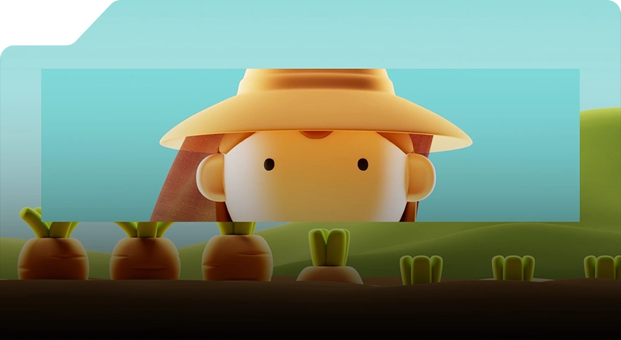
Featured Video: Motion & Graphic Design Demoreel by Hirosh Ram
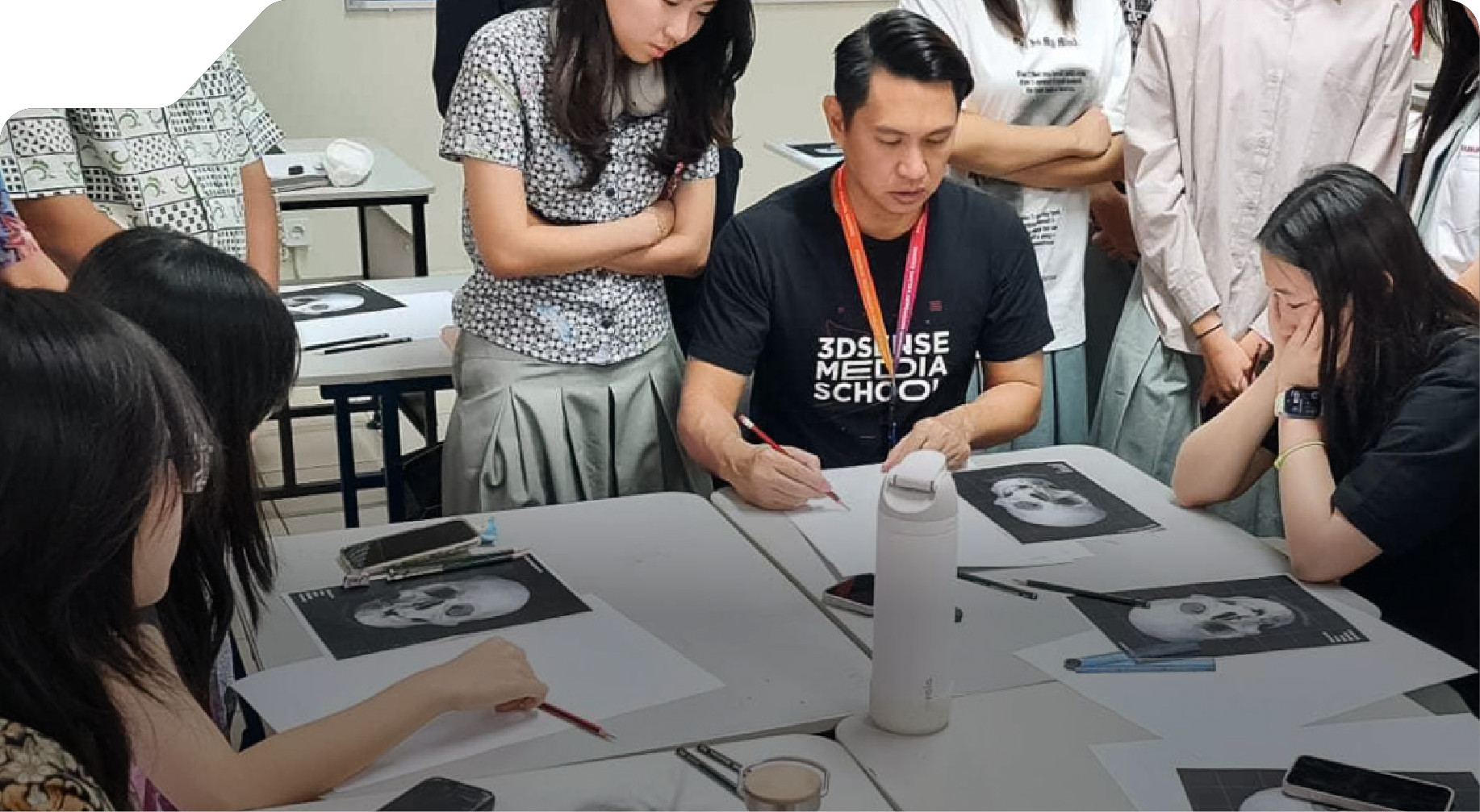
Brush Up on Your Fundamentals at 3dsense Media School
While the principles of composition may seem straightforward, mastering them requires practice, a keen eye, and a solid understanding of visual storytelling. If you’re looking to strengthen your foundational skills, 3dsense Media School offers comprehensive courses designed to help you build a strong artistic base.
Our Art & Design Foundation Diploma is a 4-month online program that provides essential training for aspiring digital artists. Students will master core art fundamentals, including traditional drawing techniques, key design principles, and aesthetic studies. The course is designed to refine your artistic flair and develop a discerning eye for art direction in creative projects. While you’ll be introduced to basic 3D concepts, the primary focus is on equipping you with a robust artistic foundation, preparing you to transition seamlessly into our full-time programs.
After completing the fundamentals course, students can progress to our 1-year specialized programs, such as our Motion Graphic Design course. Through hands-on projects and mentorship from industry experts, our design school in Singapore helps you develop your skills in digital media, preparing you for a professional career in concept art, animation, and more.